01 Printed Matter + LitLit
02 Hotel Mökki
03 Aperture Foundation
04 The Real, Virtual & Imaginary
05 Esmé
06 Mental Health America
About ︎︎︎
👋 I’m Roxy Chen, a foodie, part-time traveler, music lover, and friendly graphic designer who loves crafting delightful experiences. Thanks for being here :) About me ︎︎︎
Contact ︎︎︎
Say hello at roxy.chen2425@gmail.com or
find me on LinkedIn. Let's get in touch :)
©2024 Roxy (Xinyi) Chen. All Rights Reserved.

︎︎︎ Art Direction
︎︎︎ Brand Identity
︎︎︎ Generative Design
︎︎︎ Editorial Design
︎︎︎ Motion Graphics
︎︎︎ Web Design
︎︎︎ Brand Identity
︎︎︎ Generative Design
︎︎︎ Editorial Design
︎︎︎ Motion Graphics
︎︎︎ Web Design
Founded in 1976, Printed Matter is one of the world’s leading
non-profit organizations dedicated to the
dissemination, understanding, and appreciation
of artists’ books. PM has built a reputation for its support of artists and their visionary artistic projects worldwide, inviting more people to understand printed books as an artwork that creates a reflection on the properties of the book form itself.
The goal of this rebrand is to embody Printed Matter’s passion and
careful craft that goes behind
book making and publishing, by developing a dynamic visual language, logotype, and graphic elements. This project challenges me to
explore storytelling through traditional and merging media. I was able to bring my mixed experience in identity design
to the varied sectors of this project, such as print, screen, and spatial contexts. Together they celebrate Printed
Matter’s characterful juxtapositions with a fun and fresh makeover.
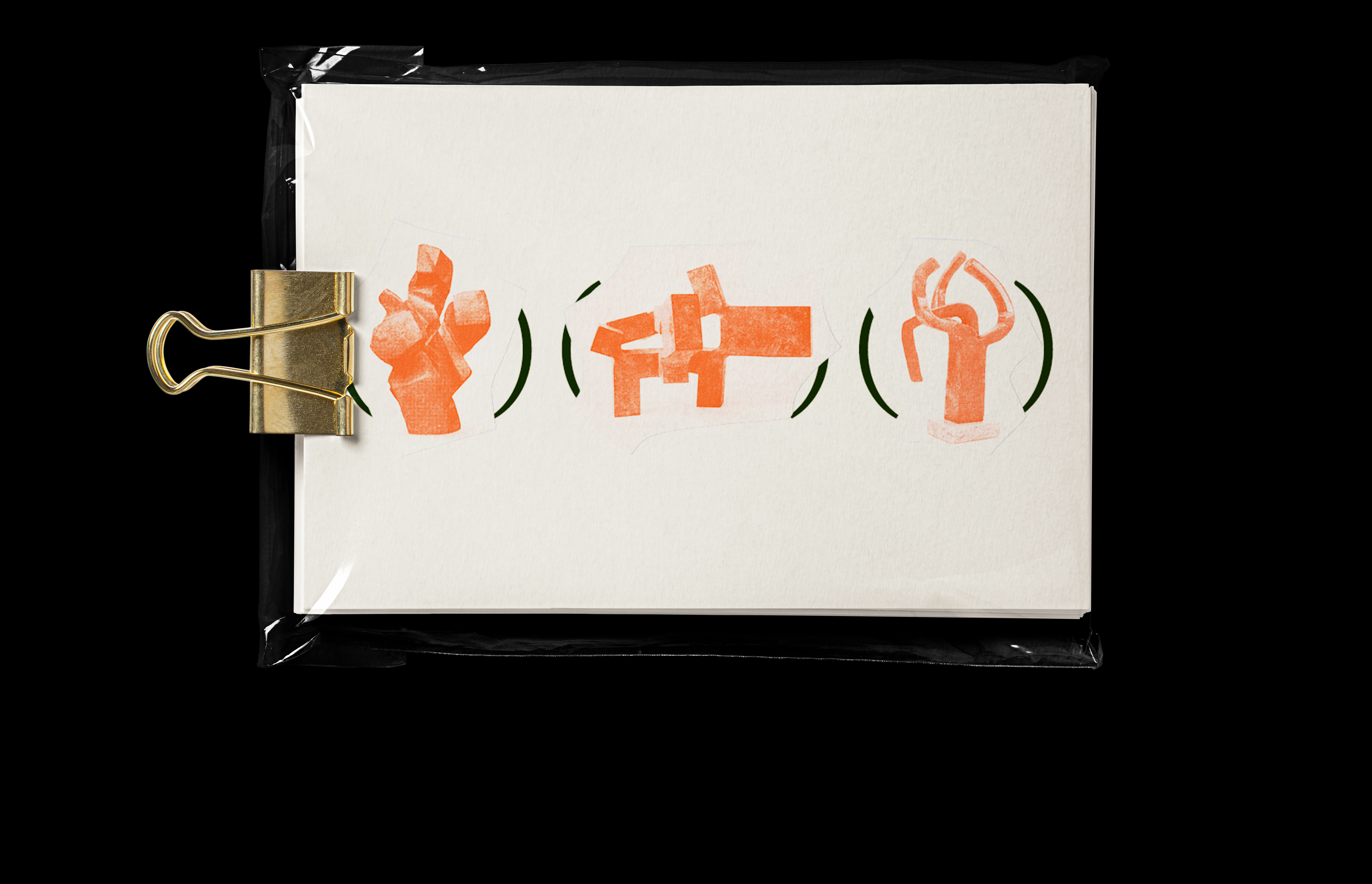
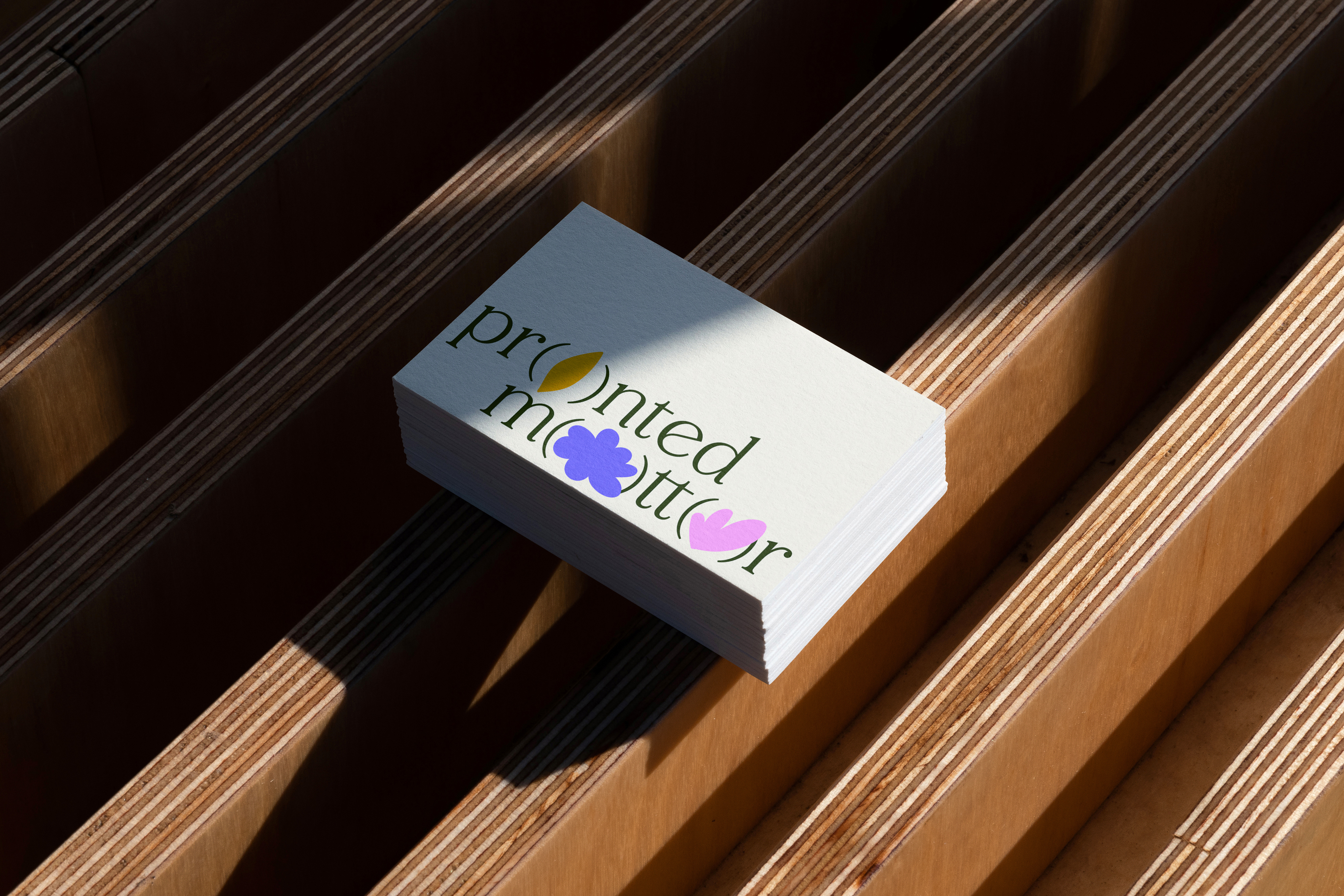
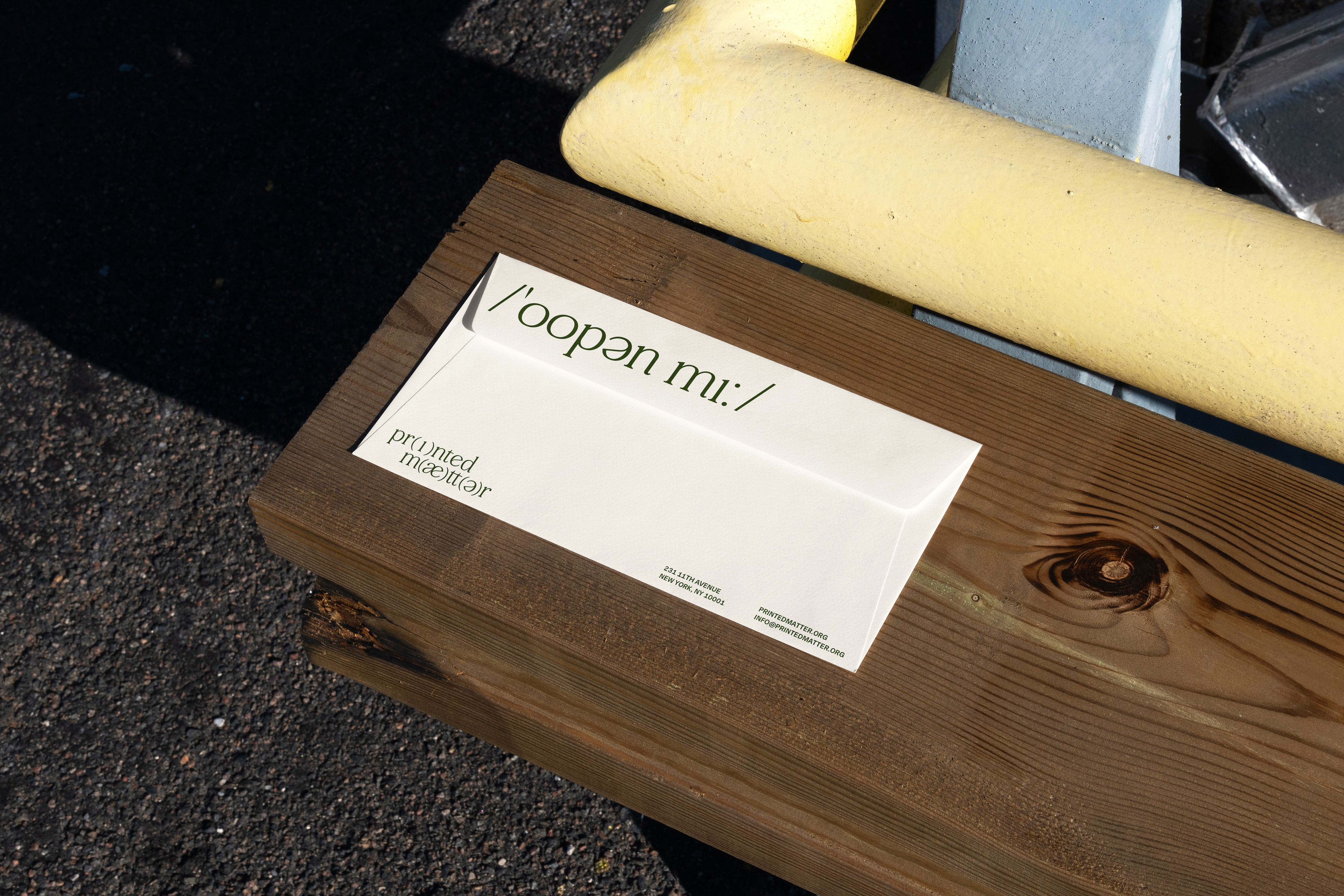
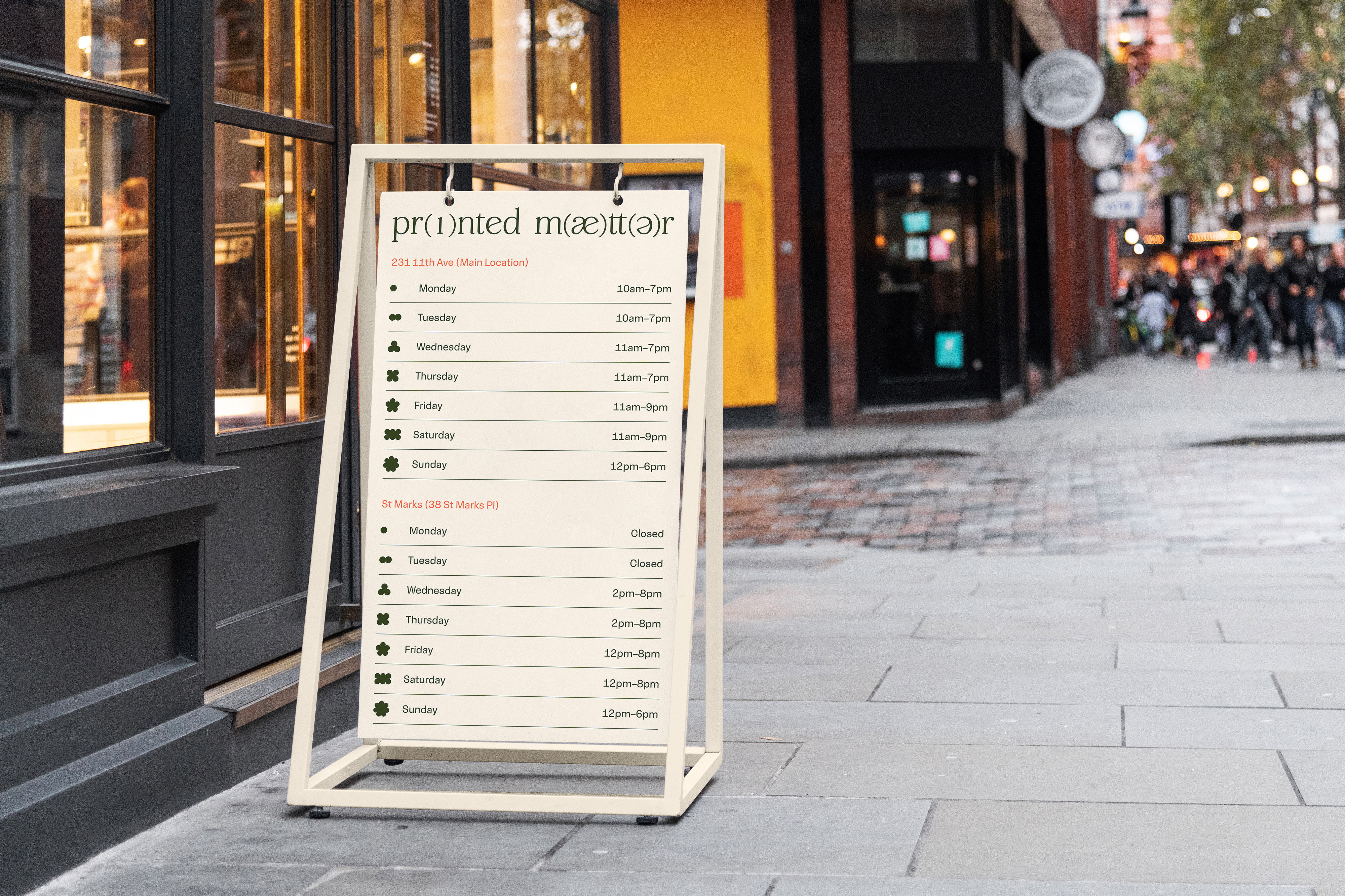
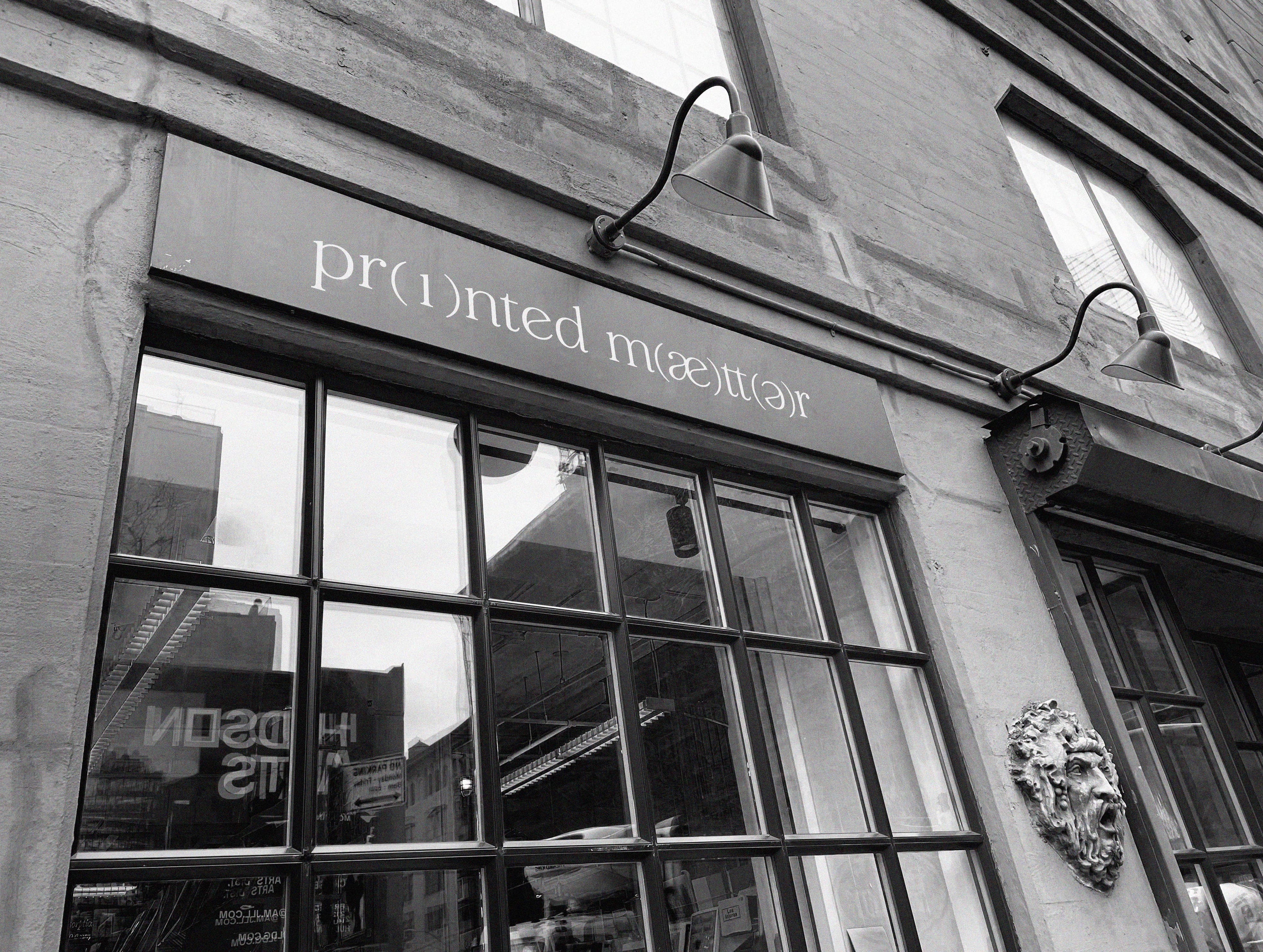
Printed Matter’s new logo identity is created based on the concept of phonetic spelling. Some of the vowels are embedded within diverse graphic elements with the purpose of creating numerous iterations with interchangeability and flexibility. The goal is to activate the logo identity, to generate different iterations of it in a constantly shifting landscape, to take the identity system itself as a space for intervention with personalities, forming, and reforming.
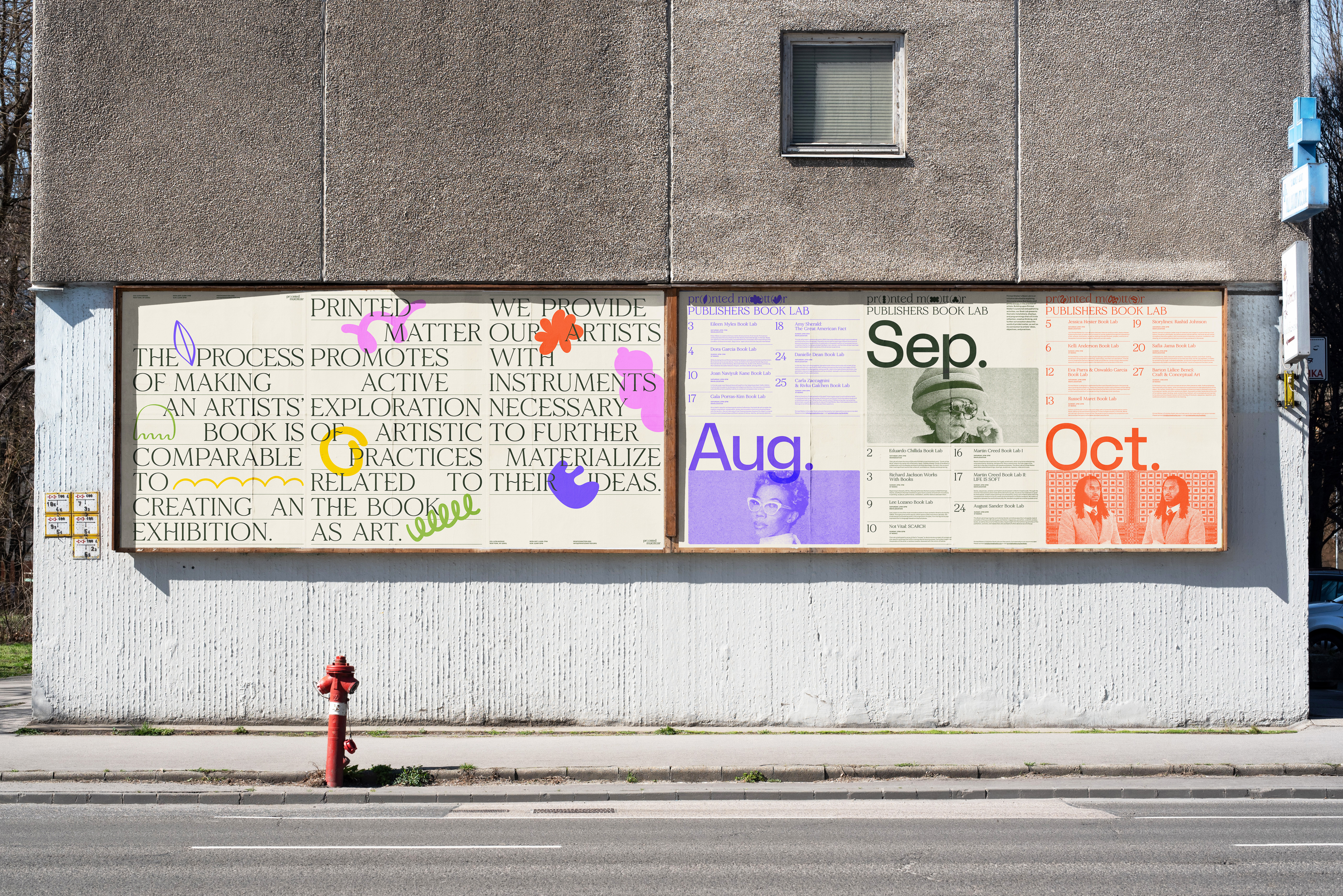
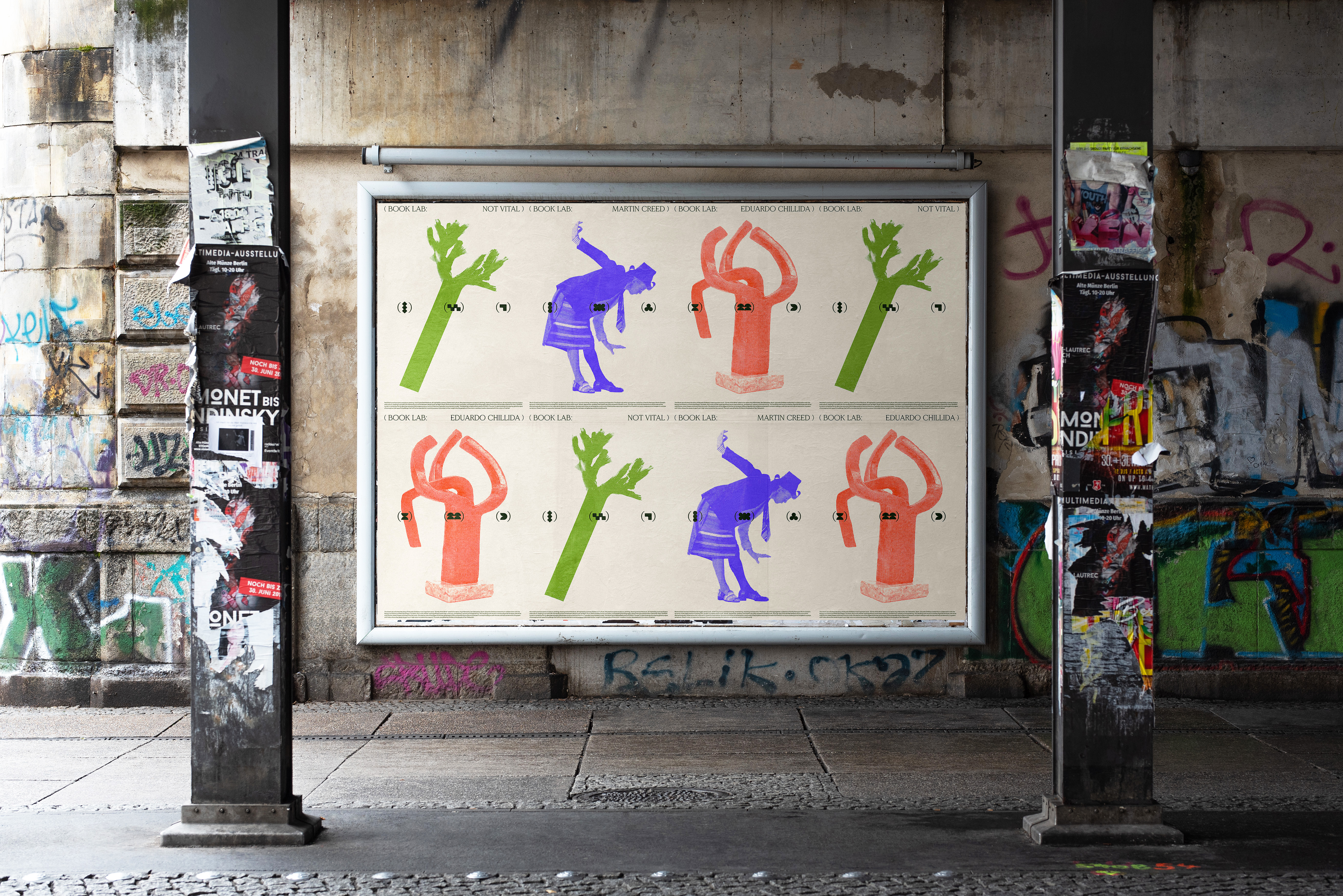
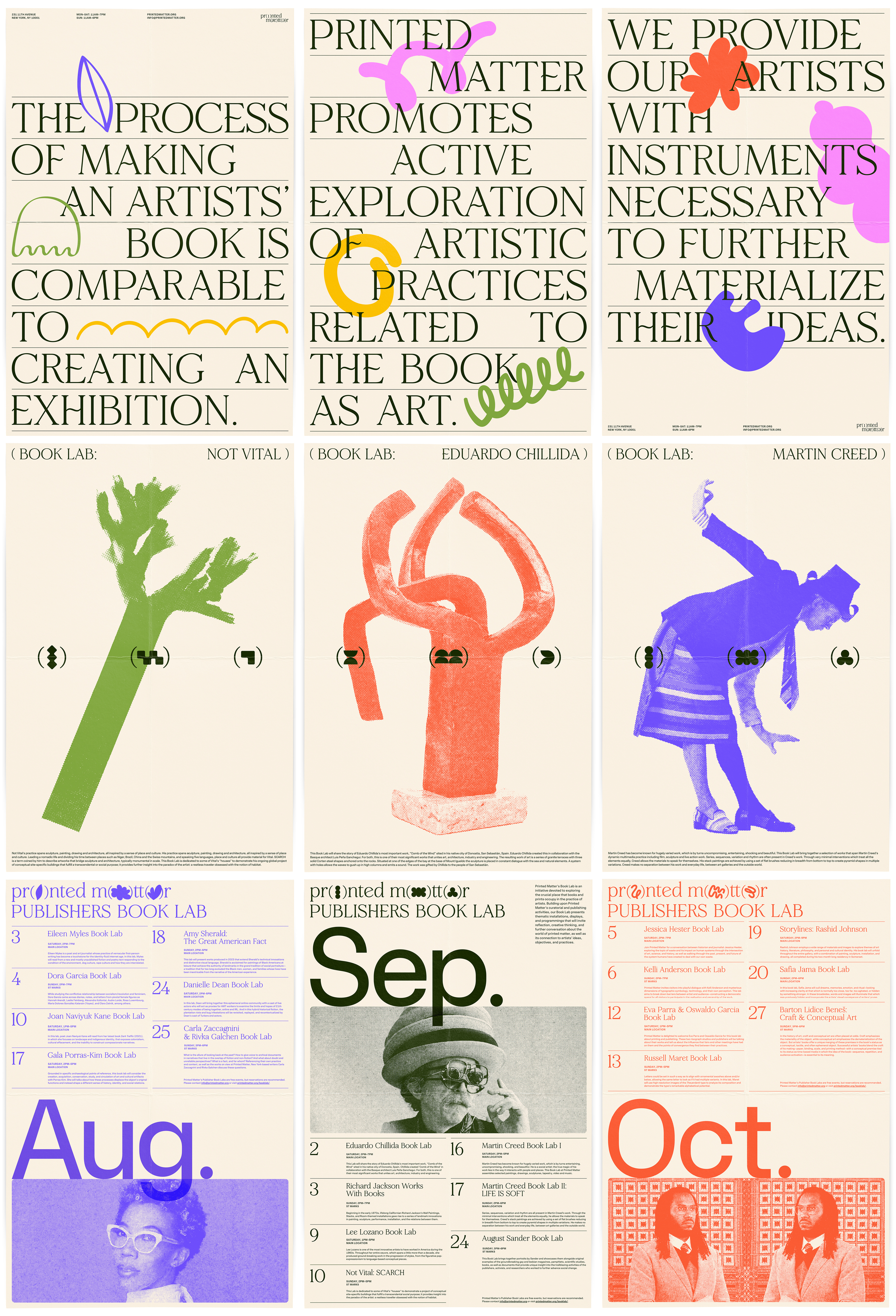
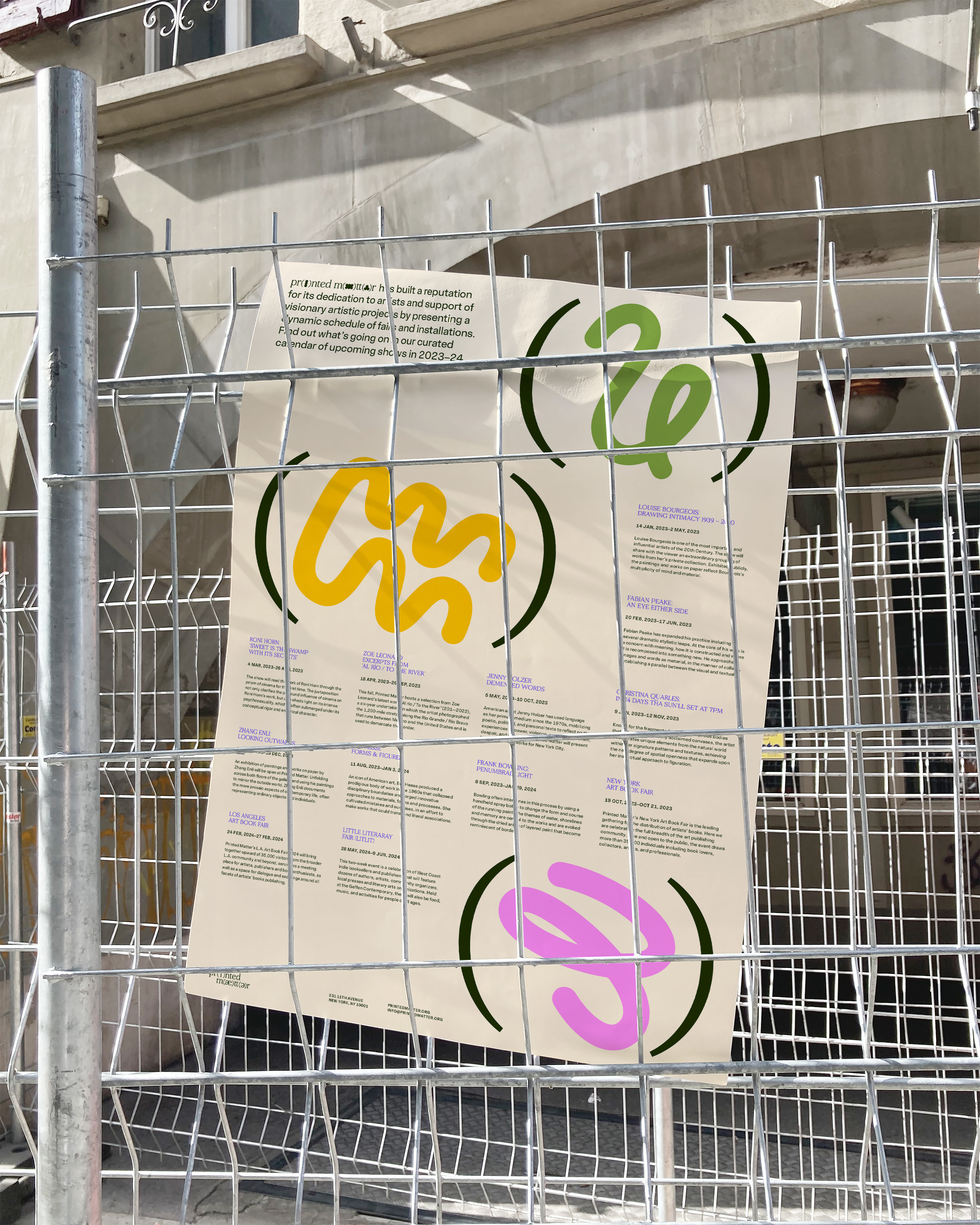
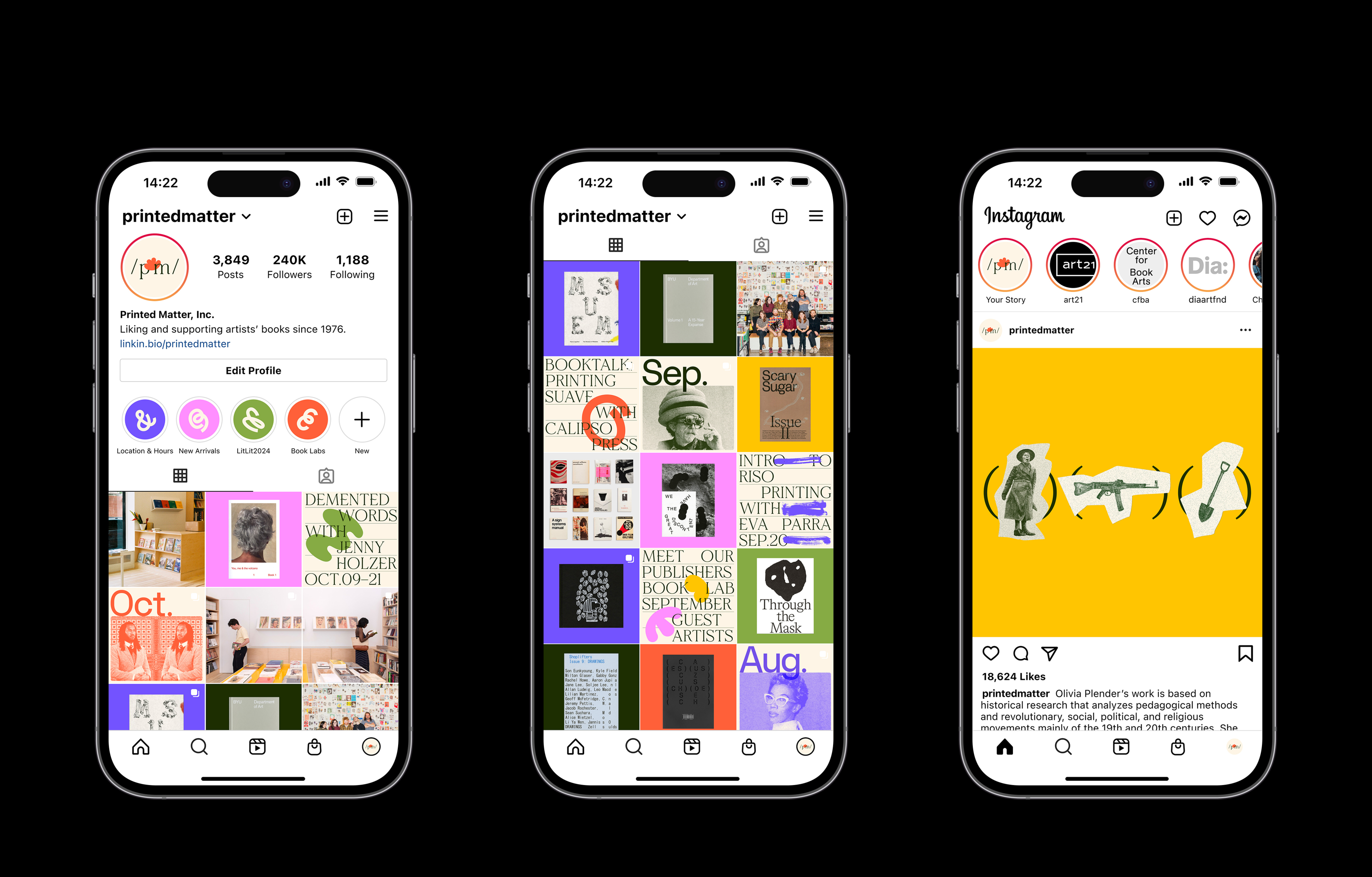
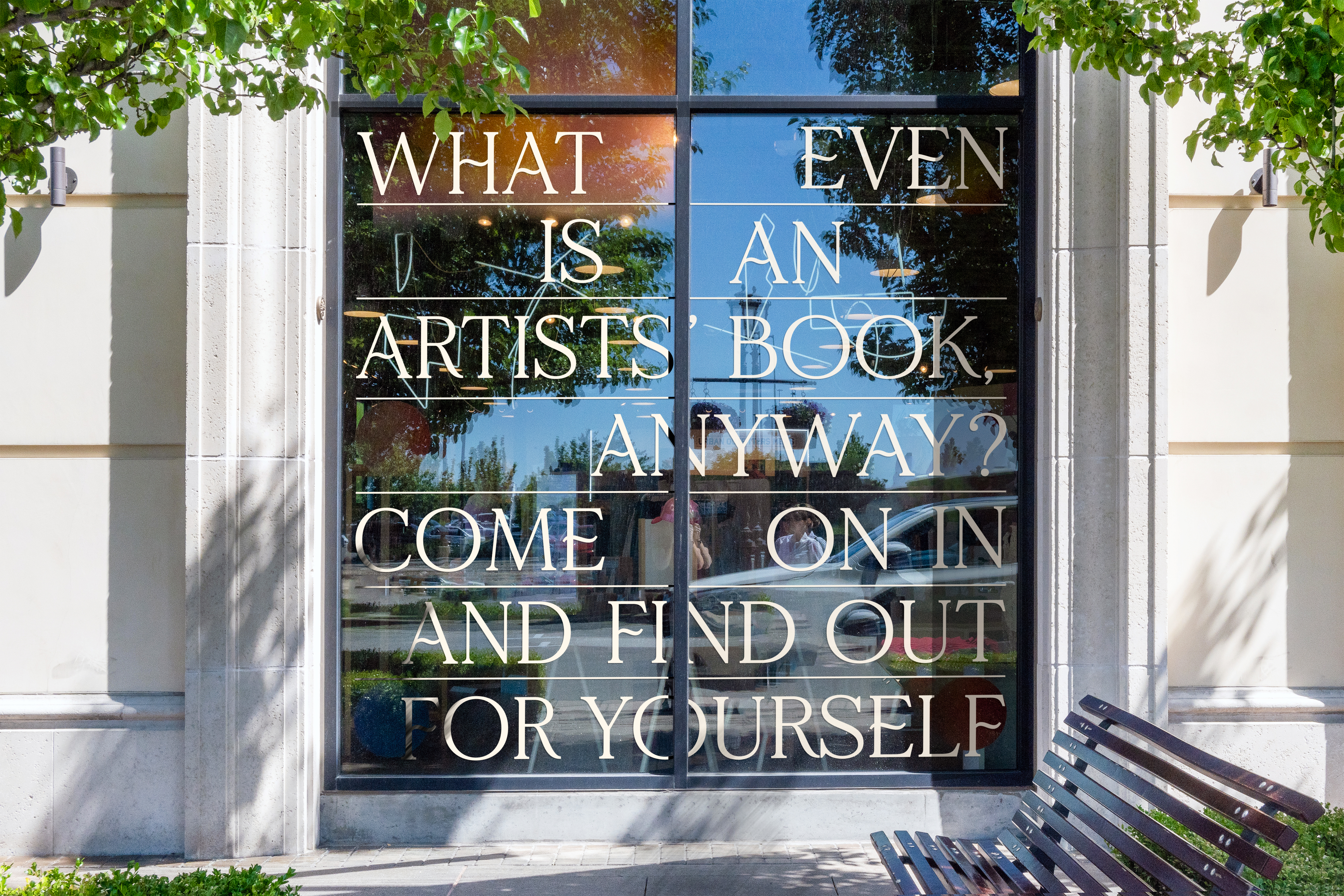
The poster series are my hero deliverables and visual playgrounds that invite the audience into the charming world of Printed Matter. The friendly and casual character is reinforced with doodle illustrations, which are highly inspired by the work of one of PM’s collaborators, TXTbooks, a publishing initiative in Brooklyn.
This 78-page brochure is a creative deliverable where I play with type, images, and their compositions. It features the thinking behind PM’s practice, by bringing together artwork on the history, present, and future of printed matter and presenting additional layers of insightful commentary in the form of interviews from key artists.

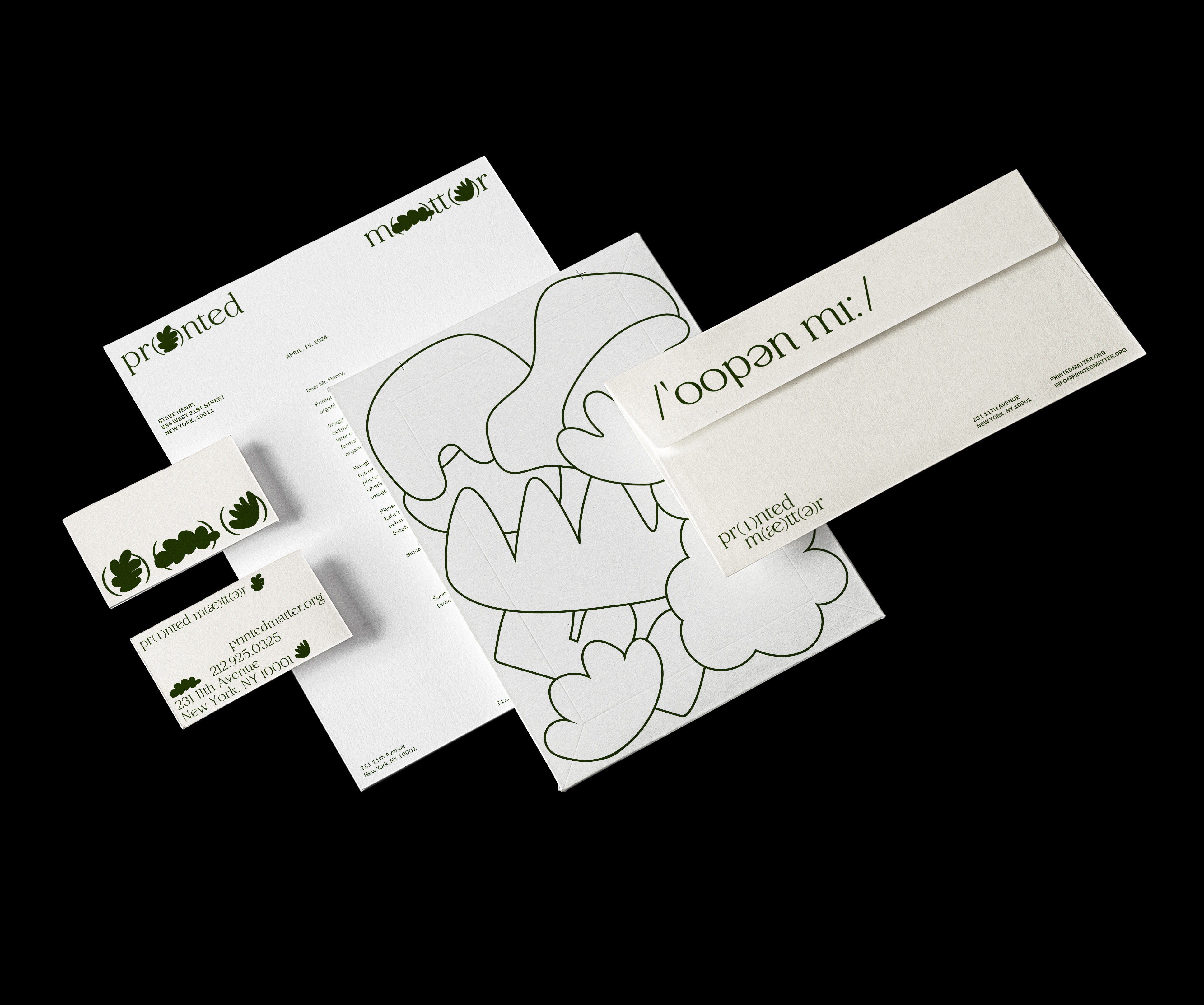

I see the stationery application as a great opportunity to put a greater level of playfulness and flexibility into the brand. The creative coding program, Processing, also provides plenty of interactivity and customizability so that the visual elements are further activated and the design can stay fresh over time.
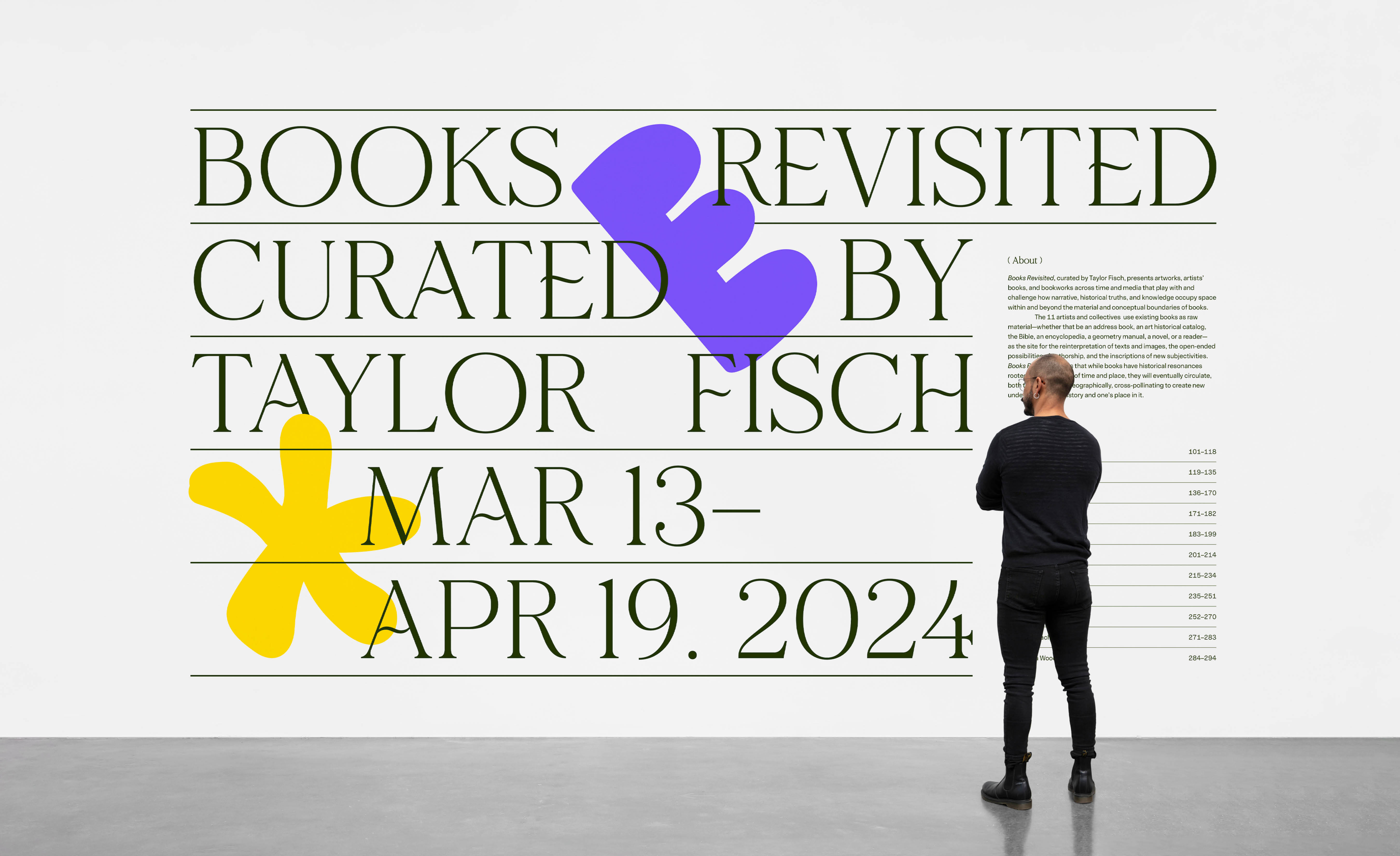
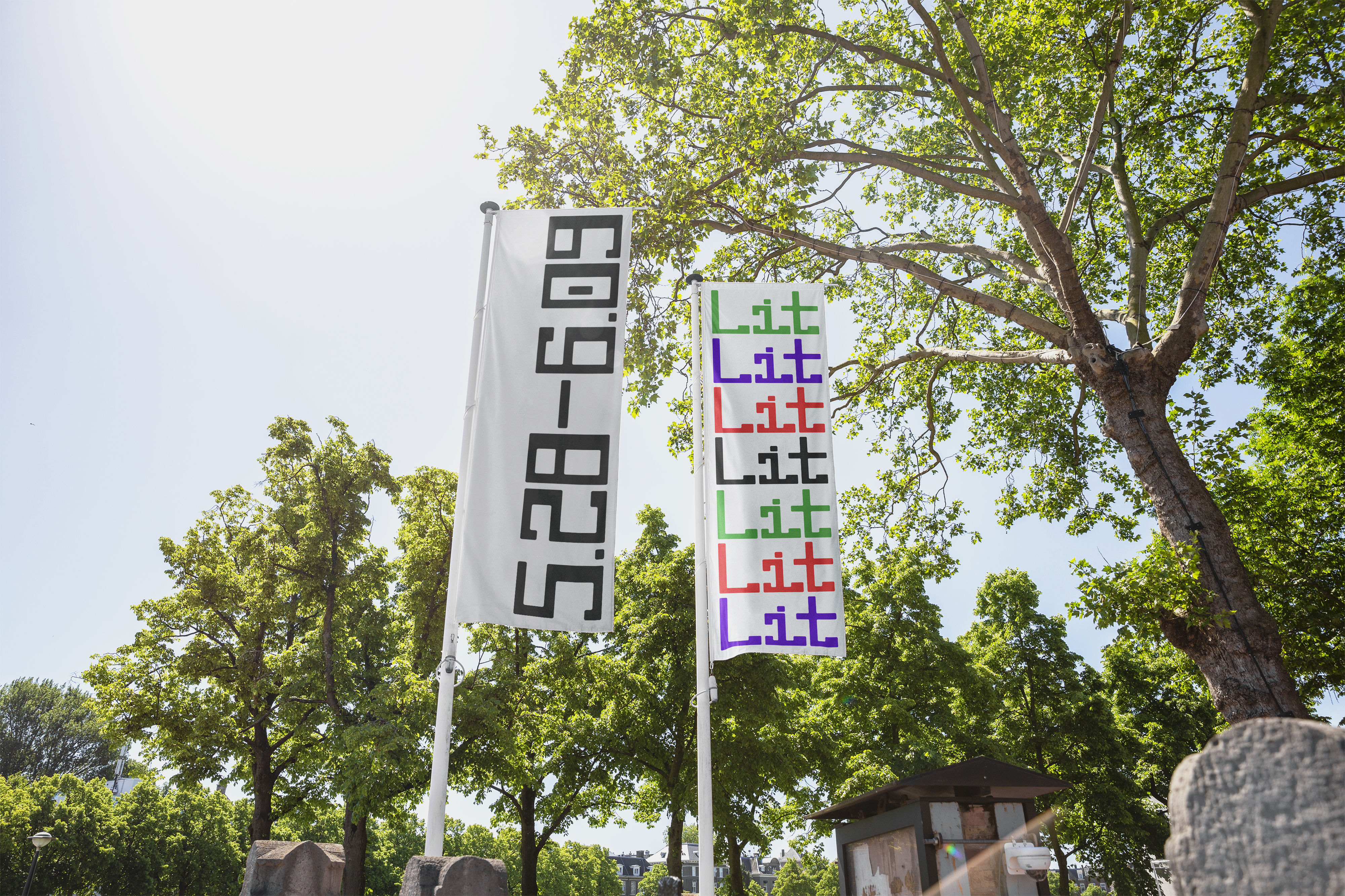
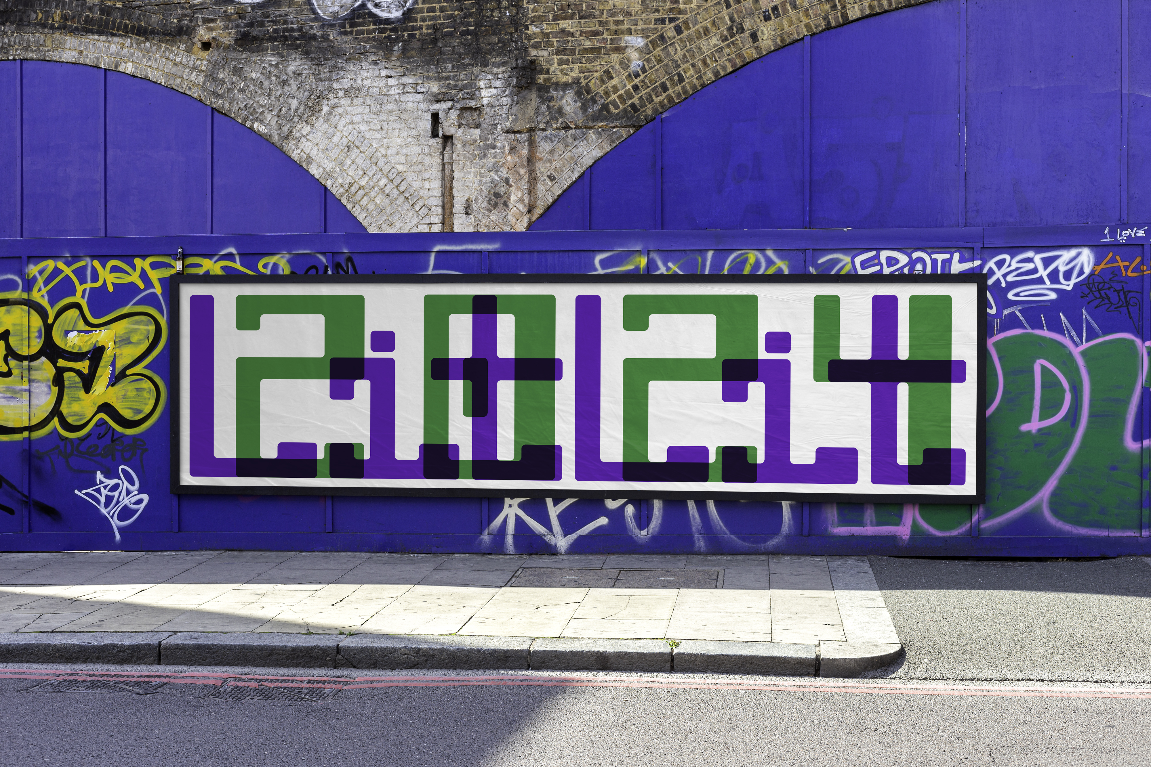
Presented by Printed Matter in partnership with The Geffen Contemporary at MOCA, LITLIT, also known as The Little Literary Fair, will return to Downtown L.A.’s Arts District in 2024, offering local presses and literary arts organizations a unique, two-week opportunity to share their perspectives, books, and goods. As an art book event that lives the umbrella of Printed Matter and as part of its mission to increase access to the world of literary and cultural production, LITLIT aims to strengthen and celebrate the transformative work of local independent presses with our L.A. community.
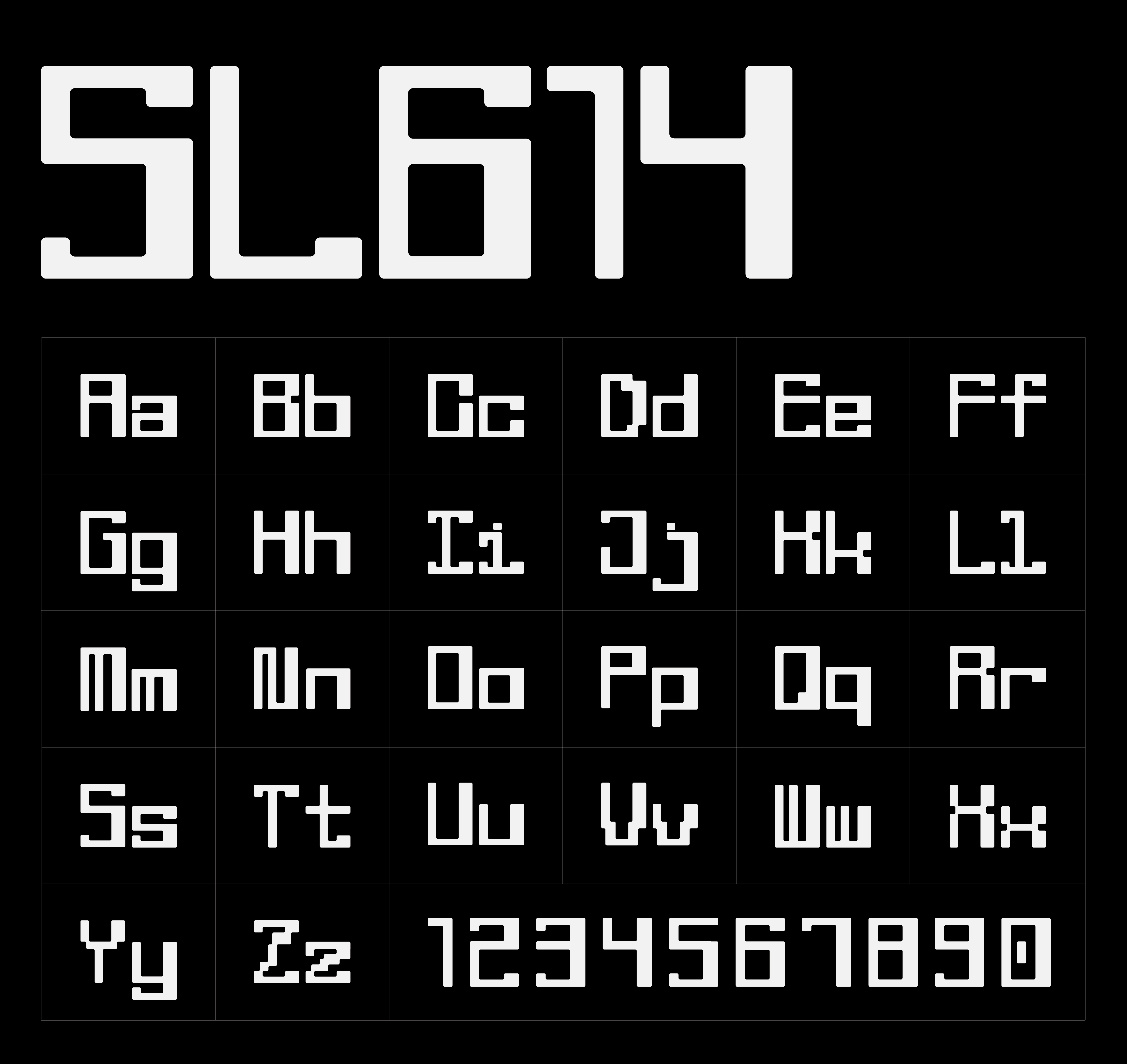
SL614 is a unique typographic system created based on one of Printed Matter’s founders, Sol Lewitt’s wall drawing No. 614. Built for bold headlines and statement pieces, this modular display font has a clear basic personality but also is perfect for strong brand building, by bringing in historical reference and connection from the larger identity and turning Sol Lewitt’s grid into a more contemporary and modular system for typography.
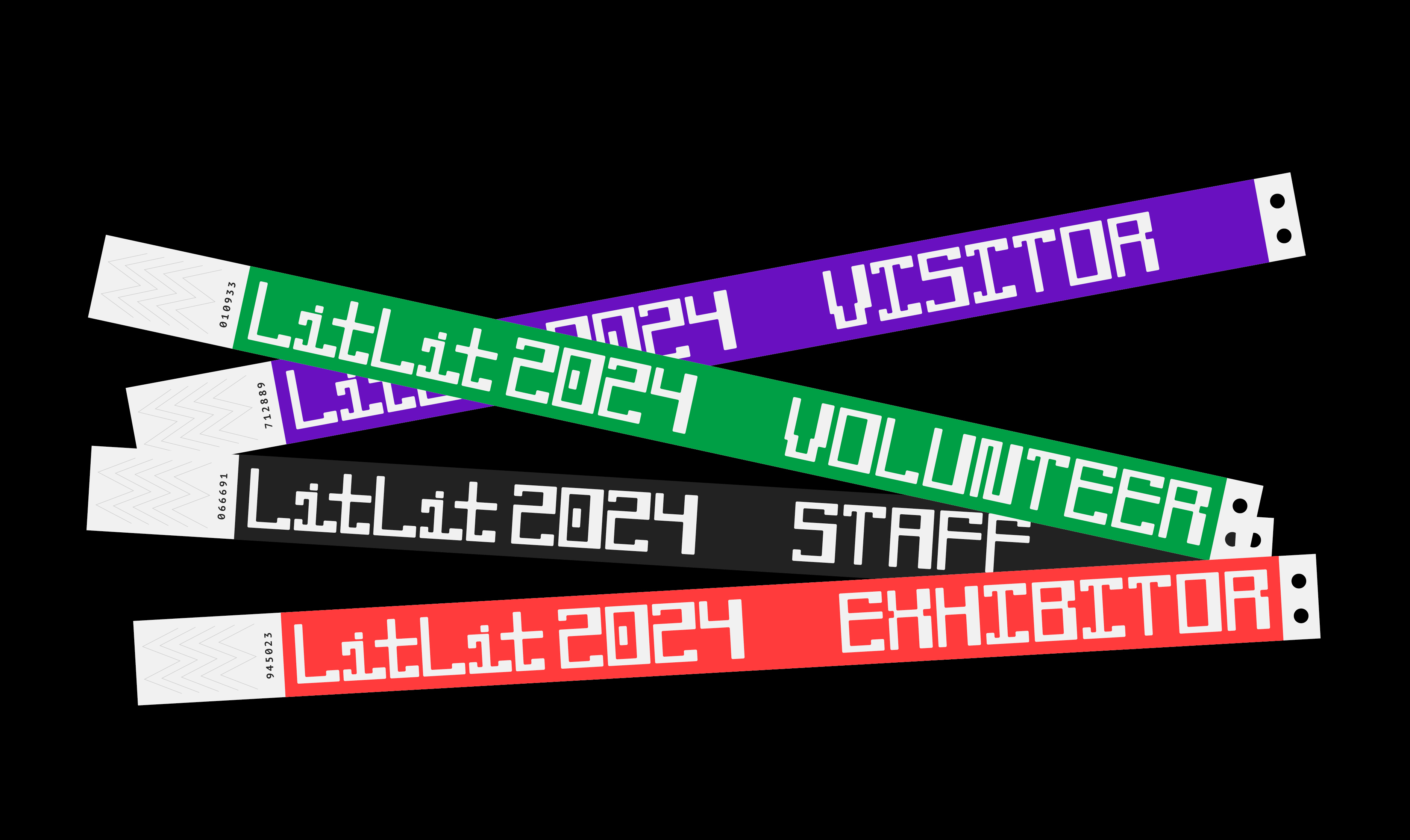
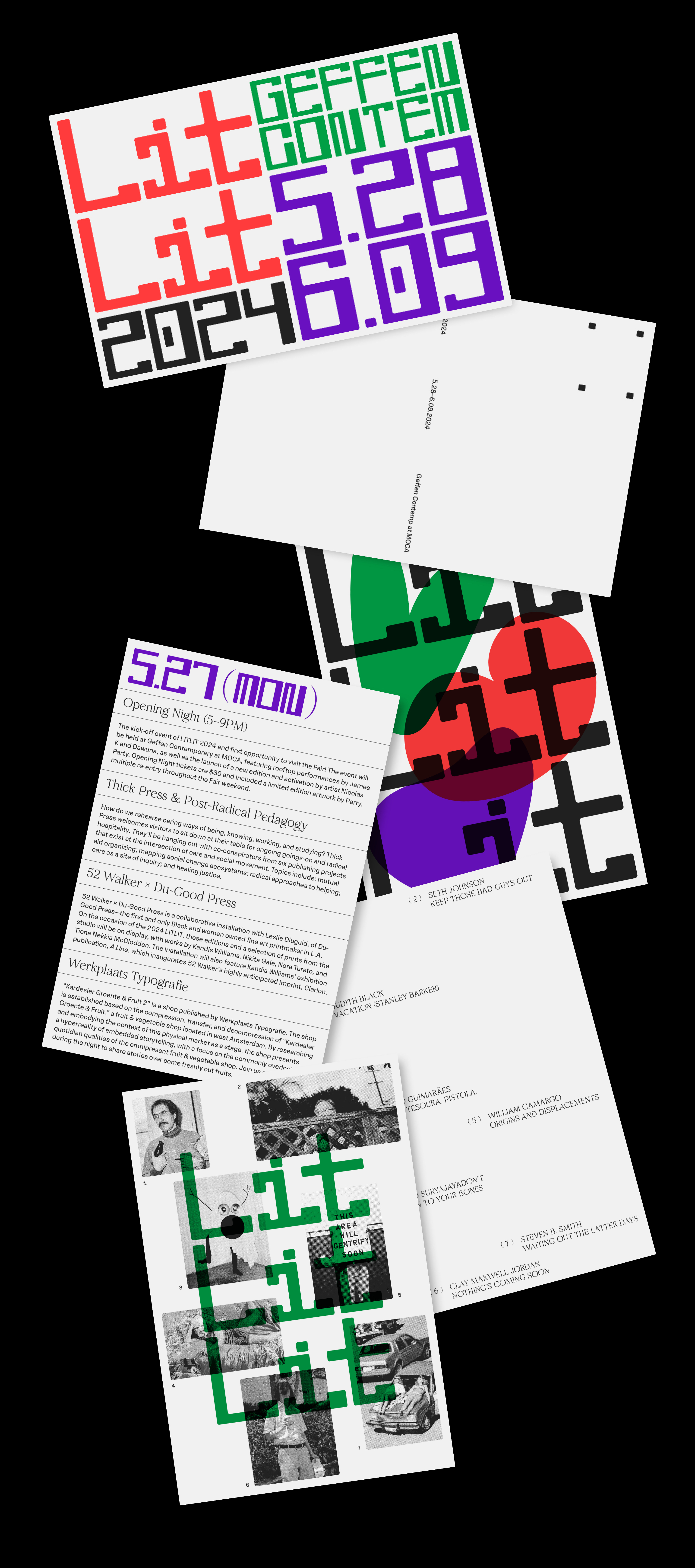
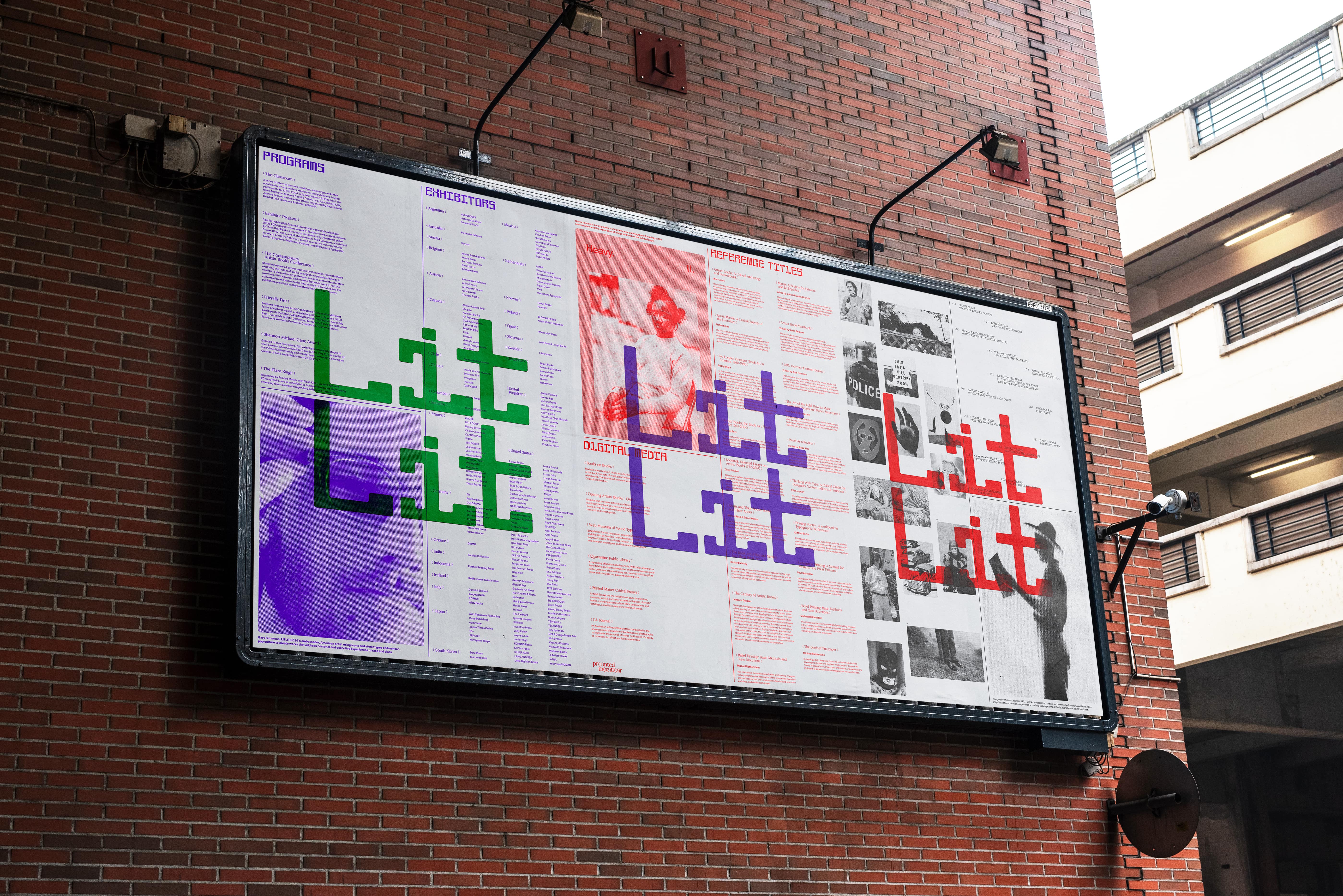
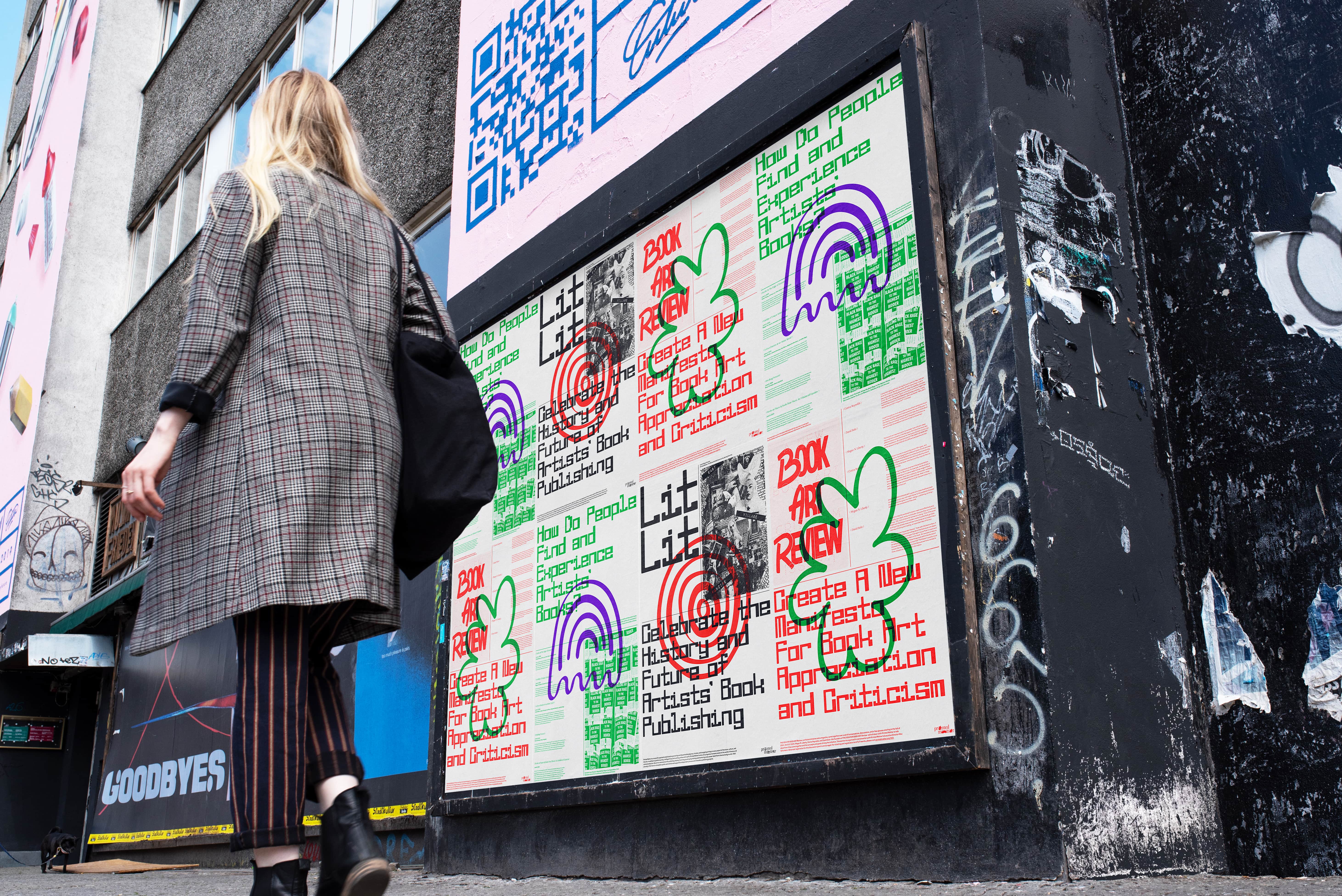
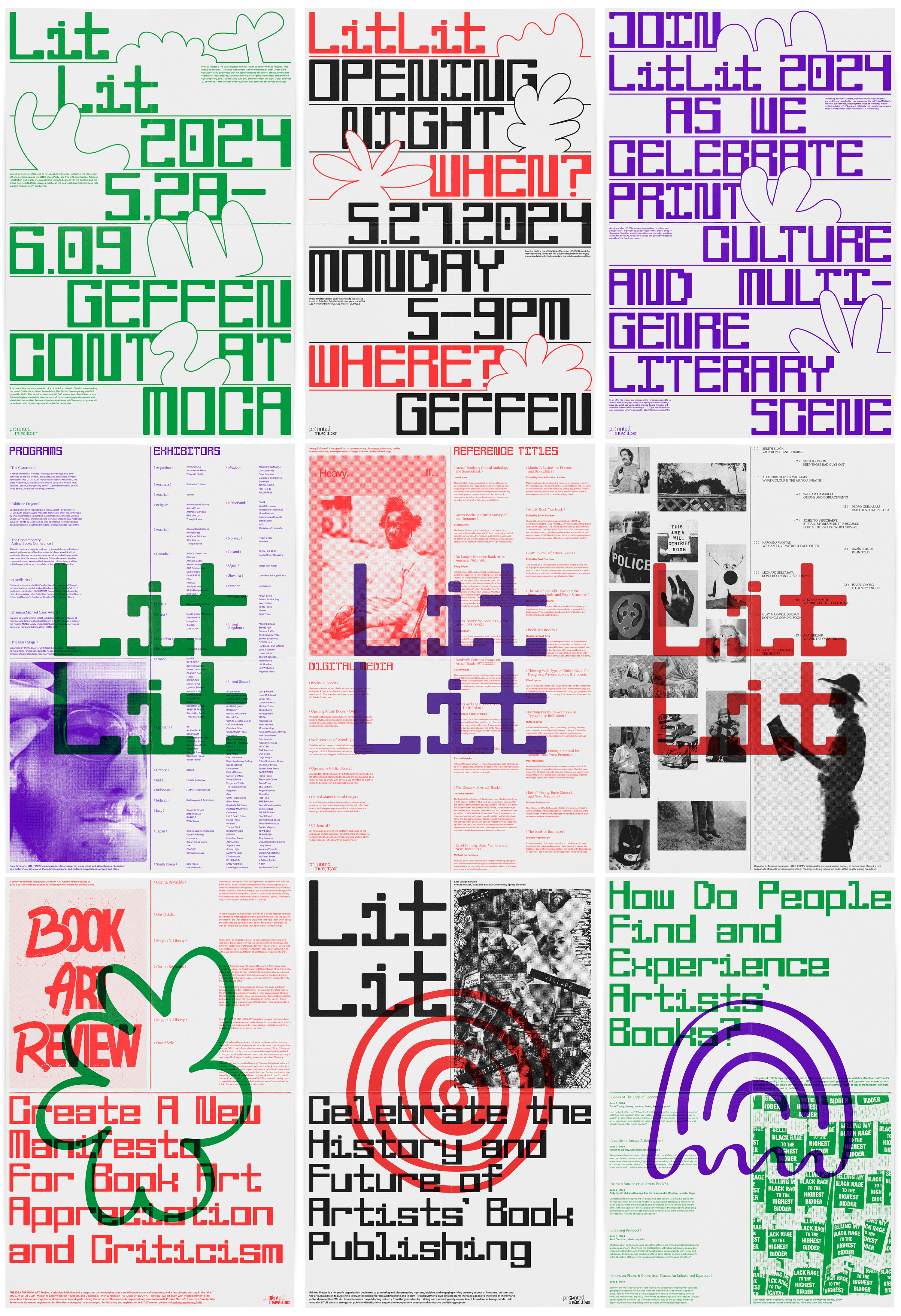
The goal is to help LitLit’s identity better reflect its resolute legacy and cultural impact. Hence, my vision and approach for this event’s visual language is strong, playful, and human, taking pride in the progressive and community-driven platform. Primarily working with a powerful combination of graphic elements, type, and color, the bold and flexible palette then allows for bursts of vivid hues and vibrant shades.
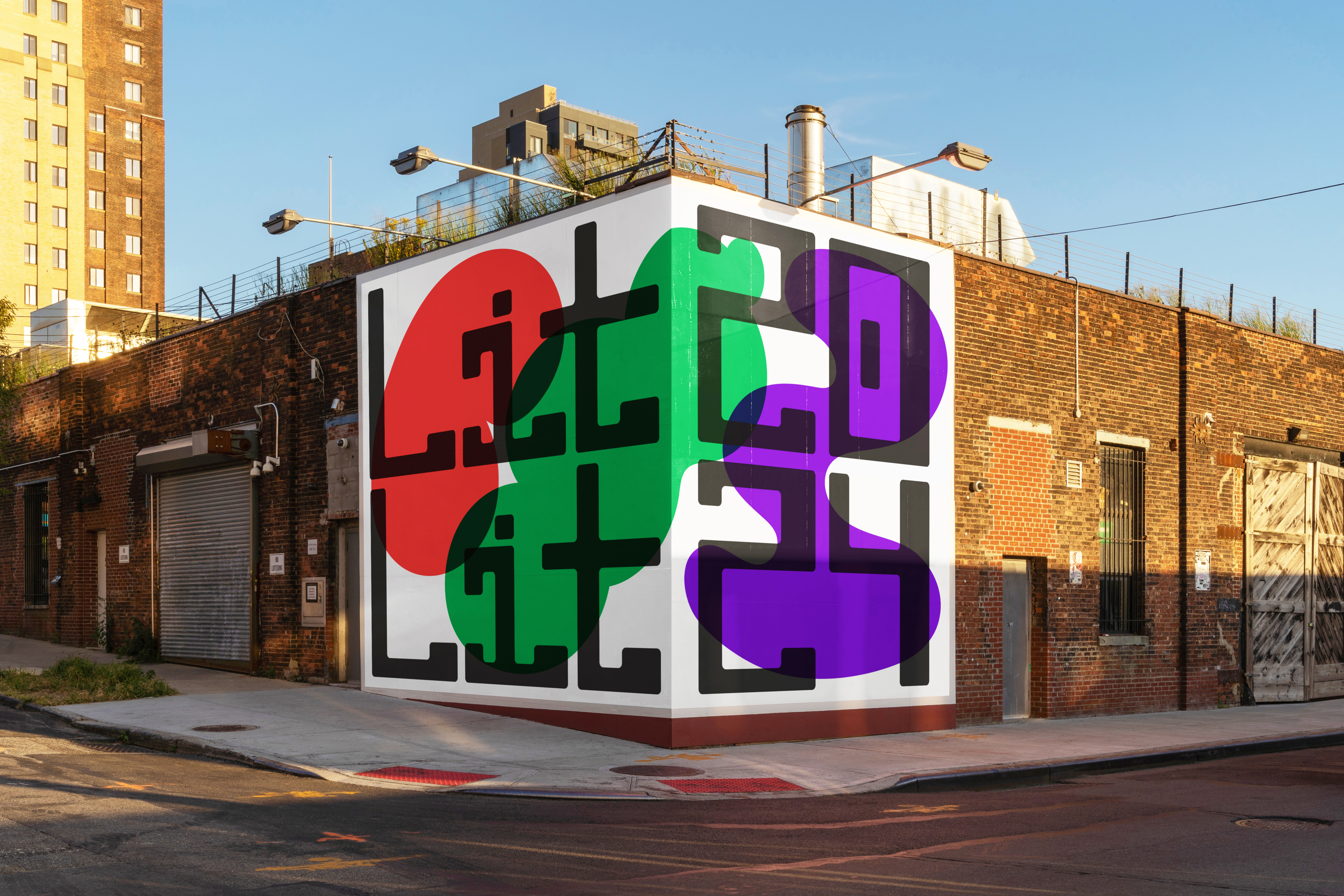
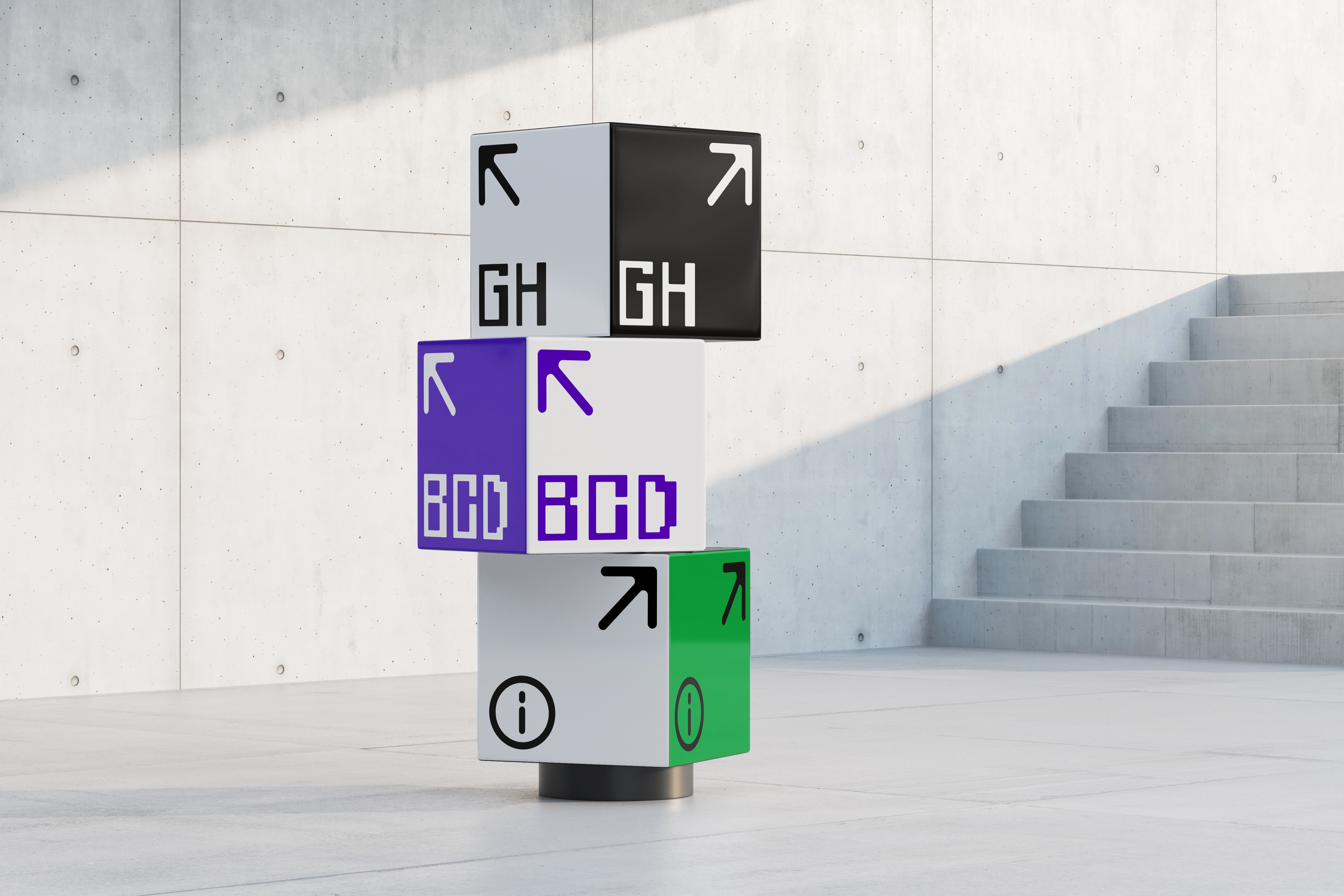
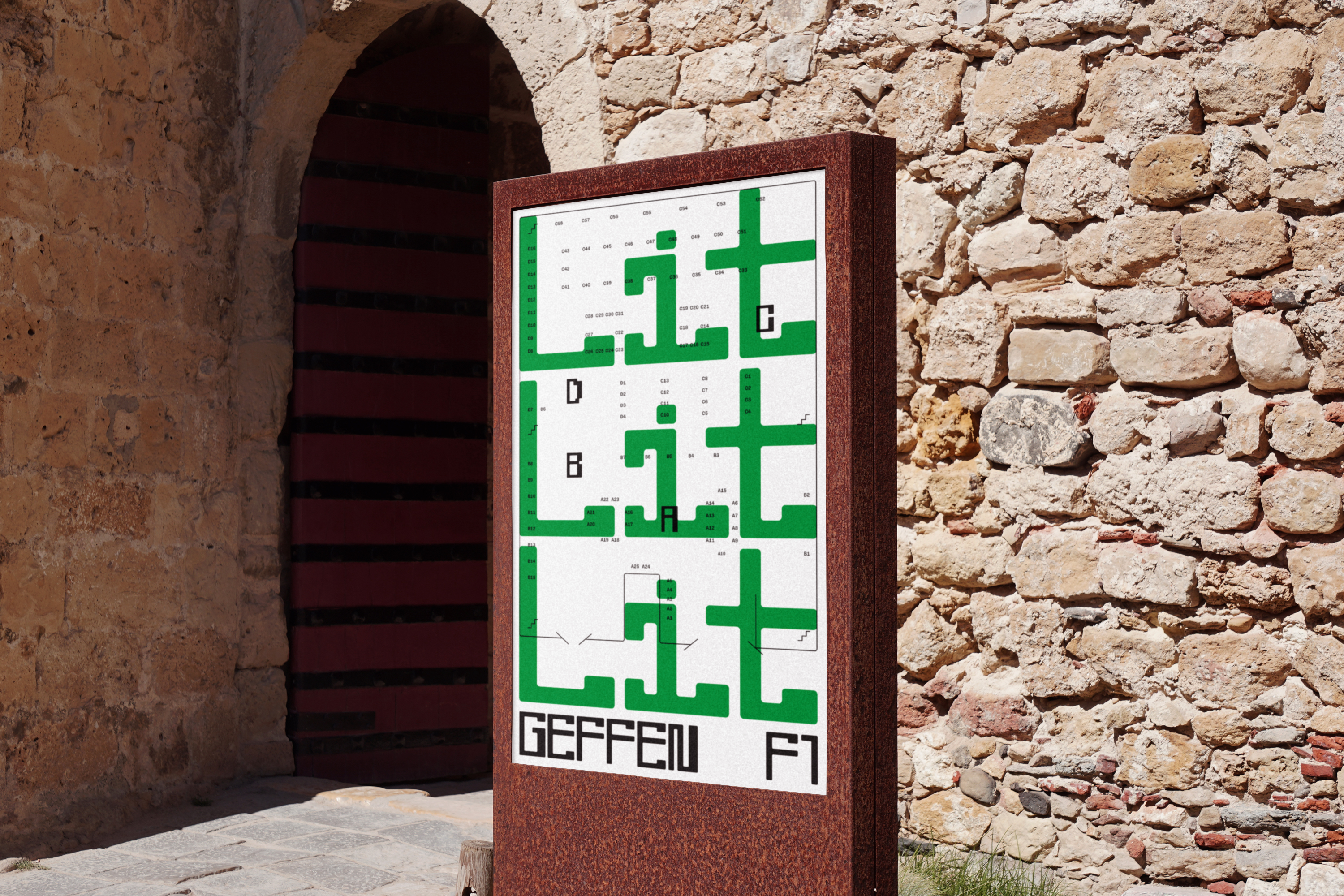
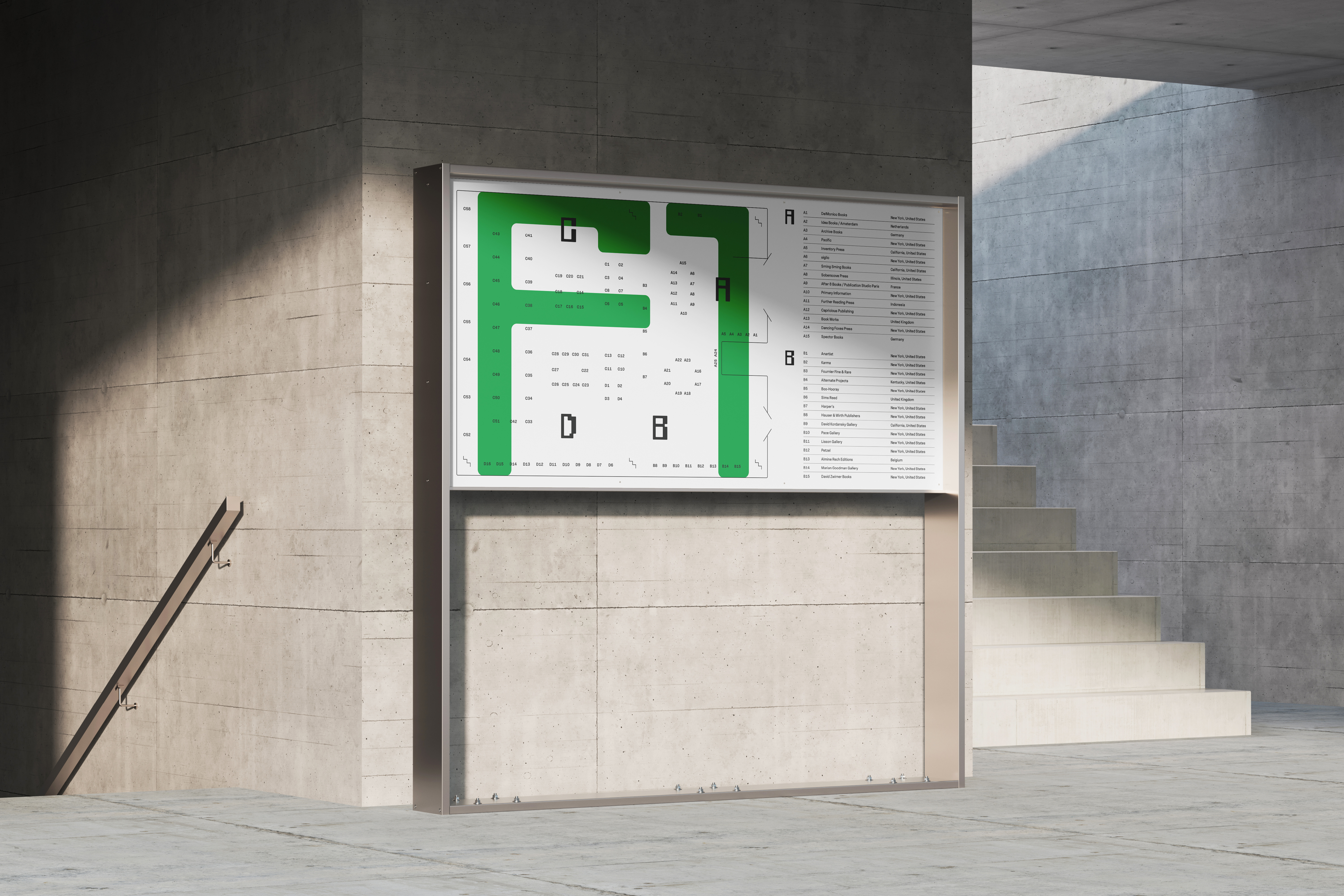
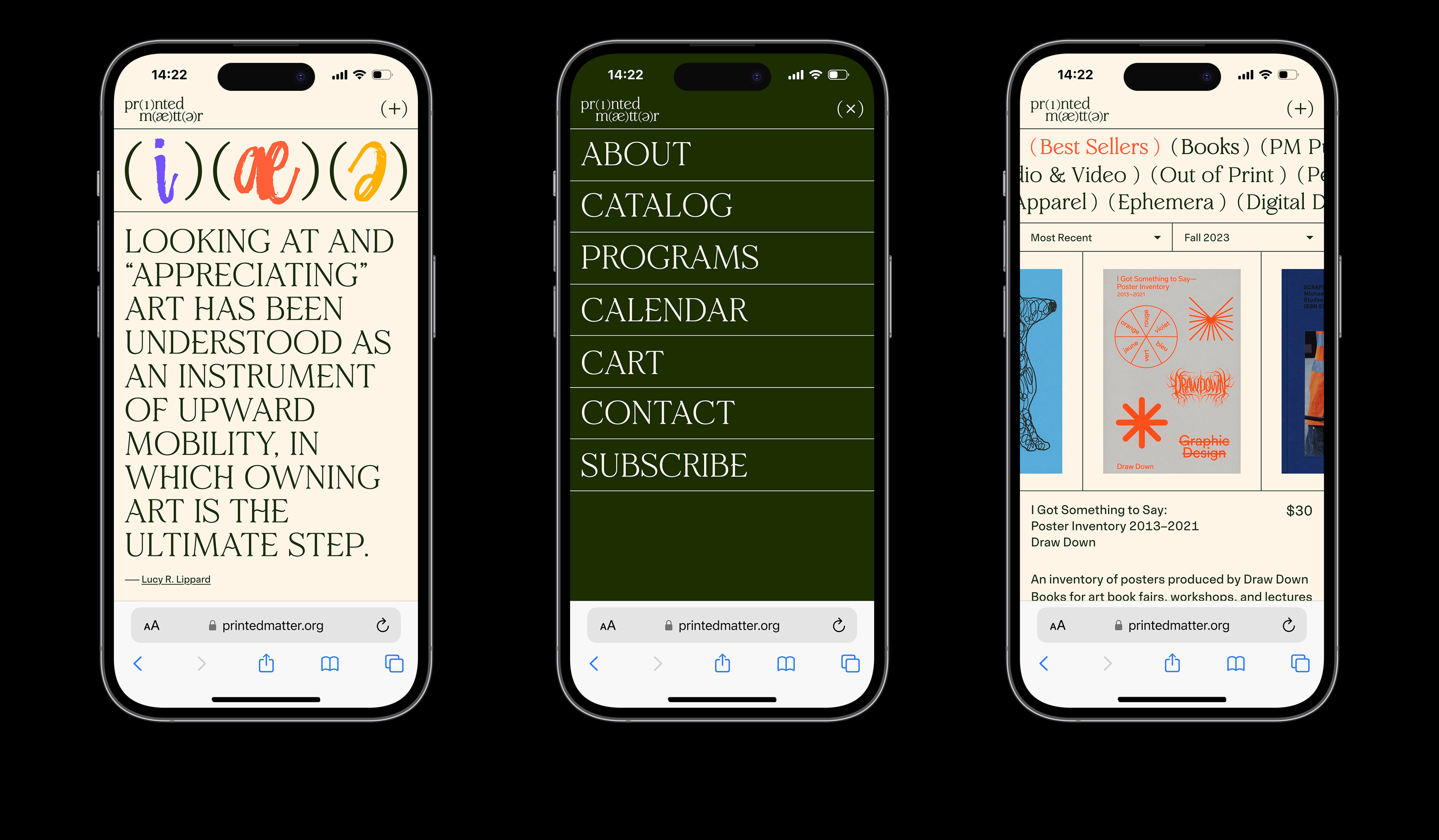
The consistent and comprehensive visual language works effortlessly with both spatial and screen-based media. It plays a functional role within the wayfinding system and navigation on the website. They are devised to visually capture the ethos of LitLit—a characterful space for L.A.’s local art book community.